projects
about
testimonials
contact
projects
about
testimonials
contact
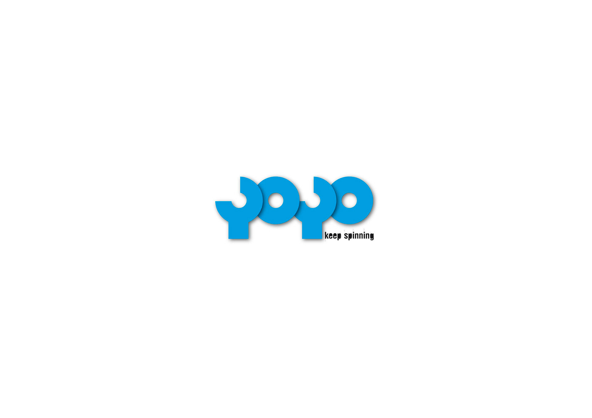
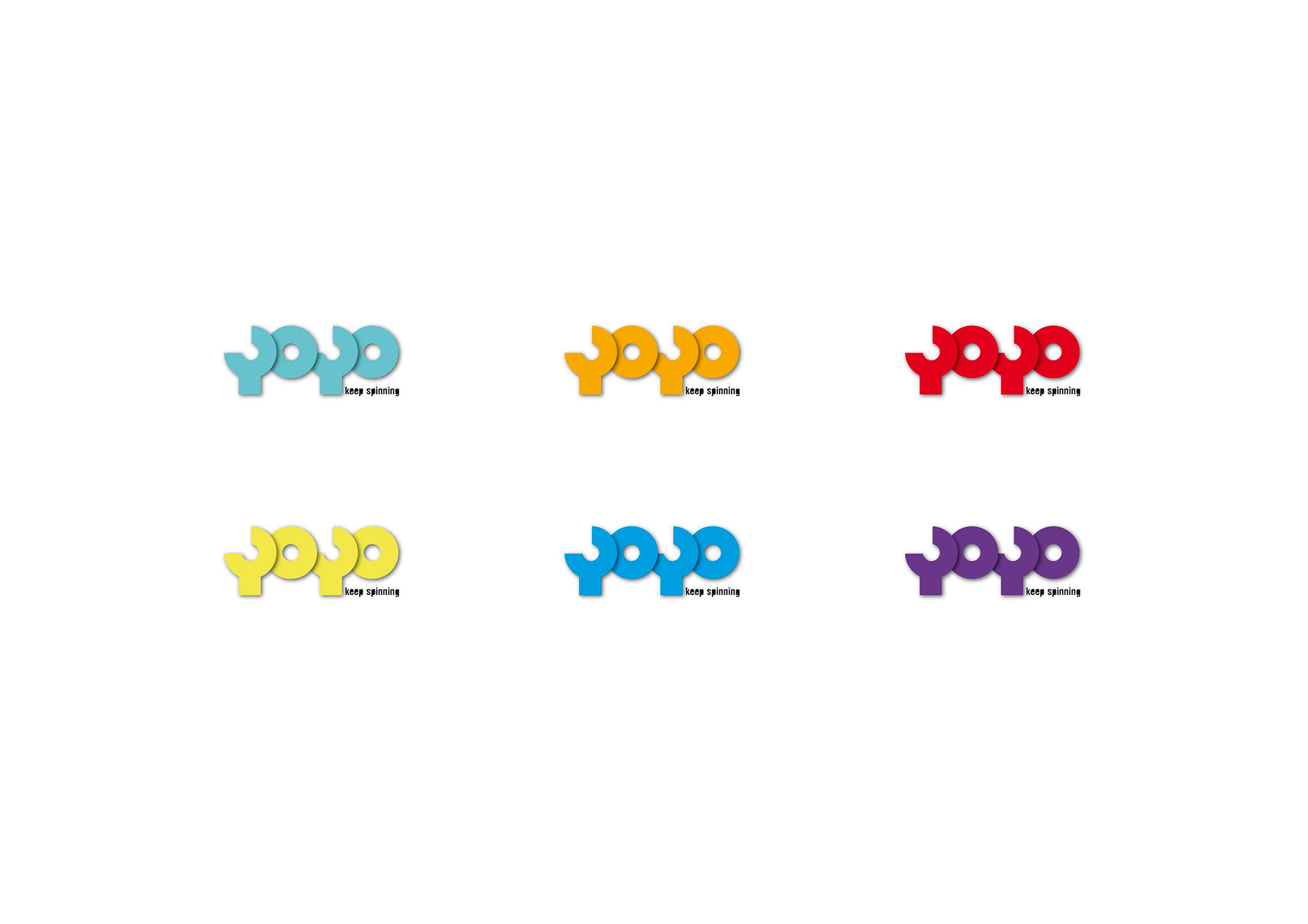
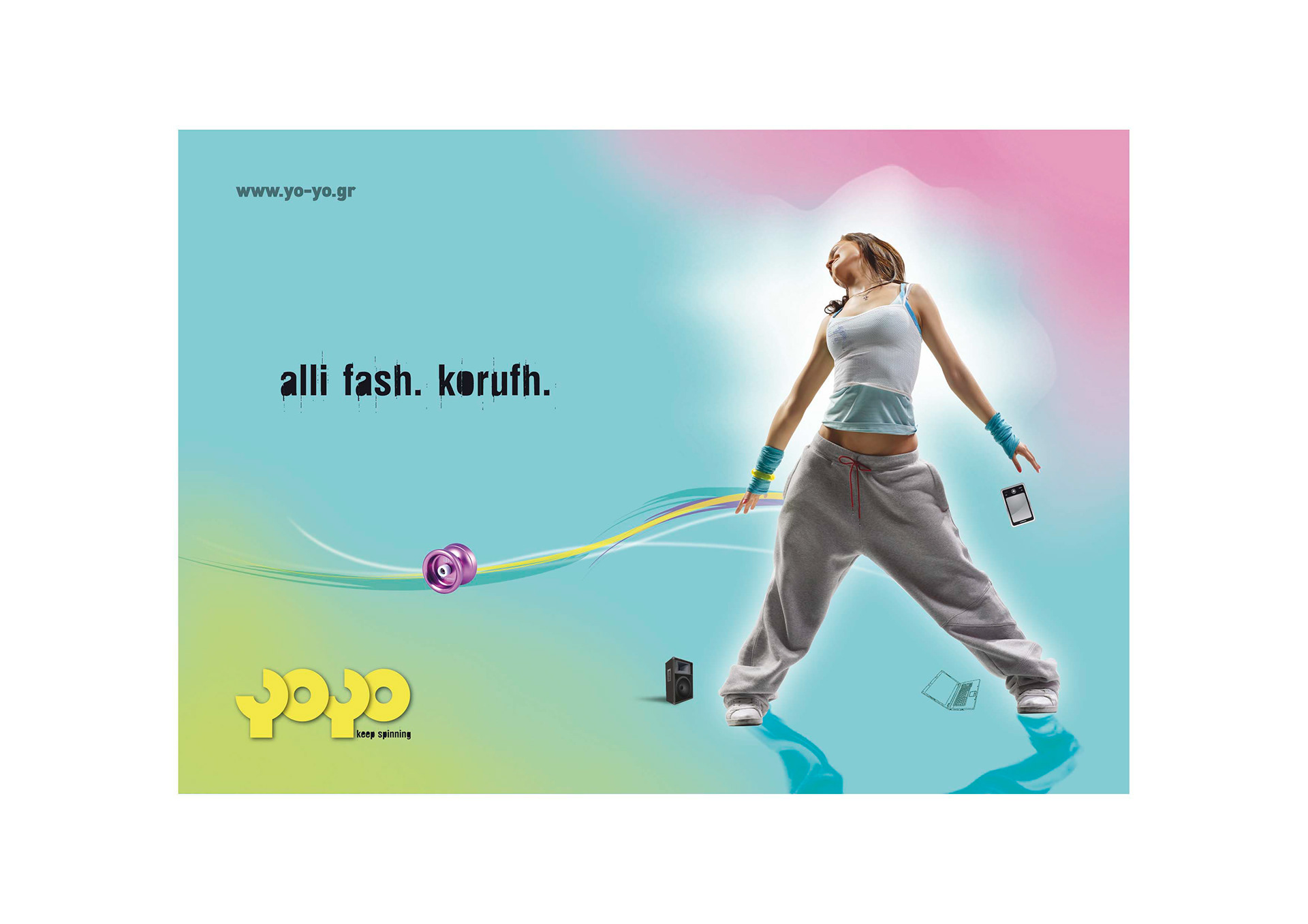
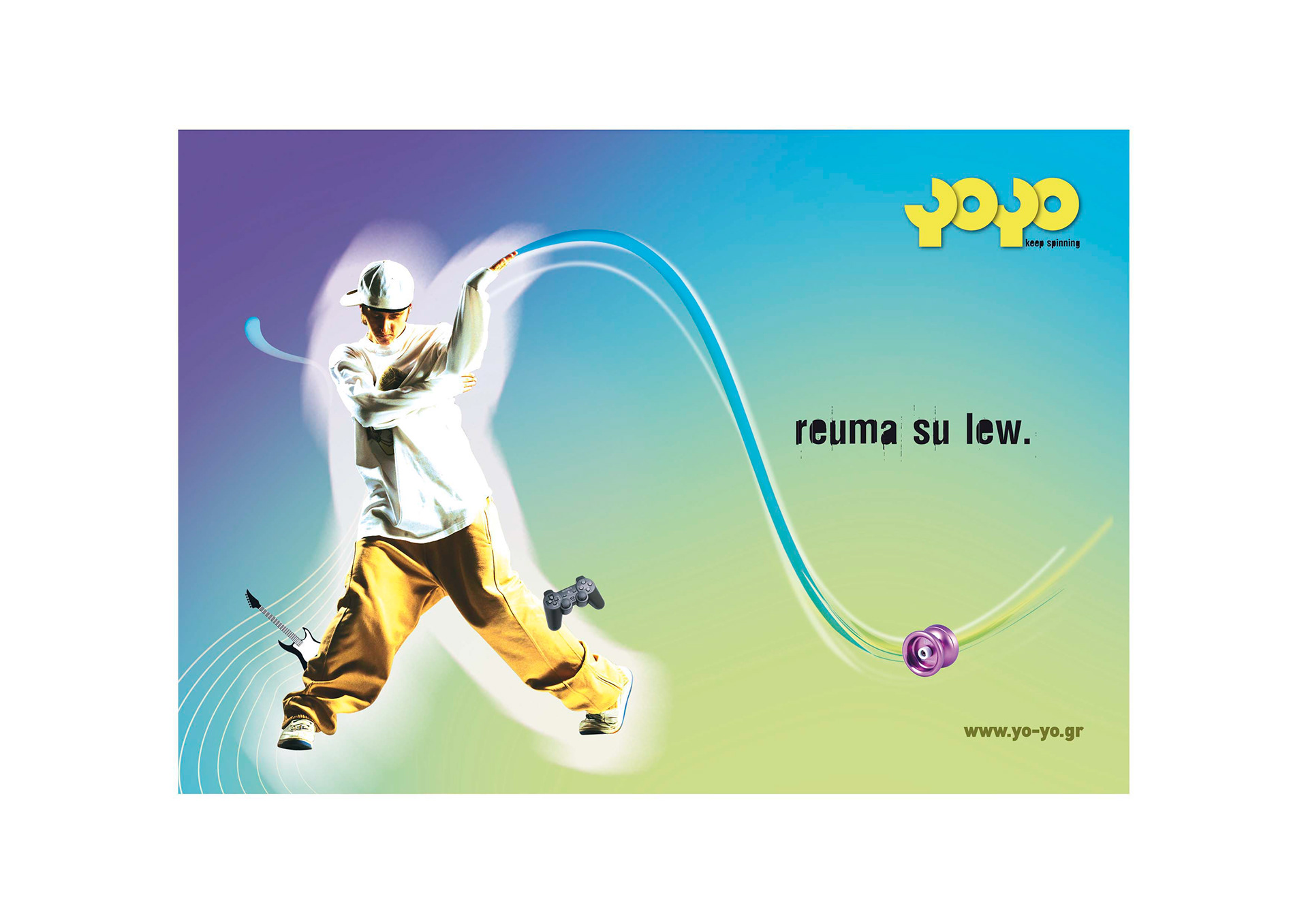
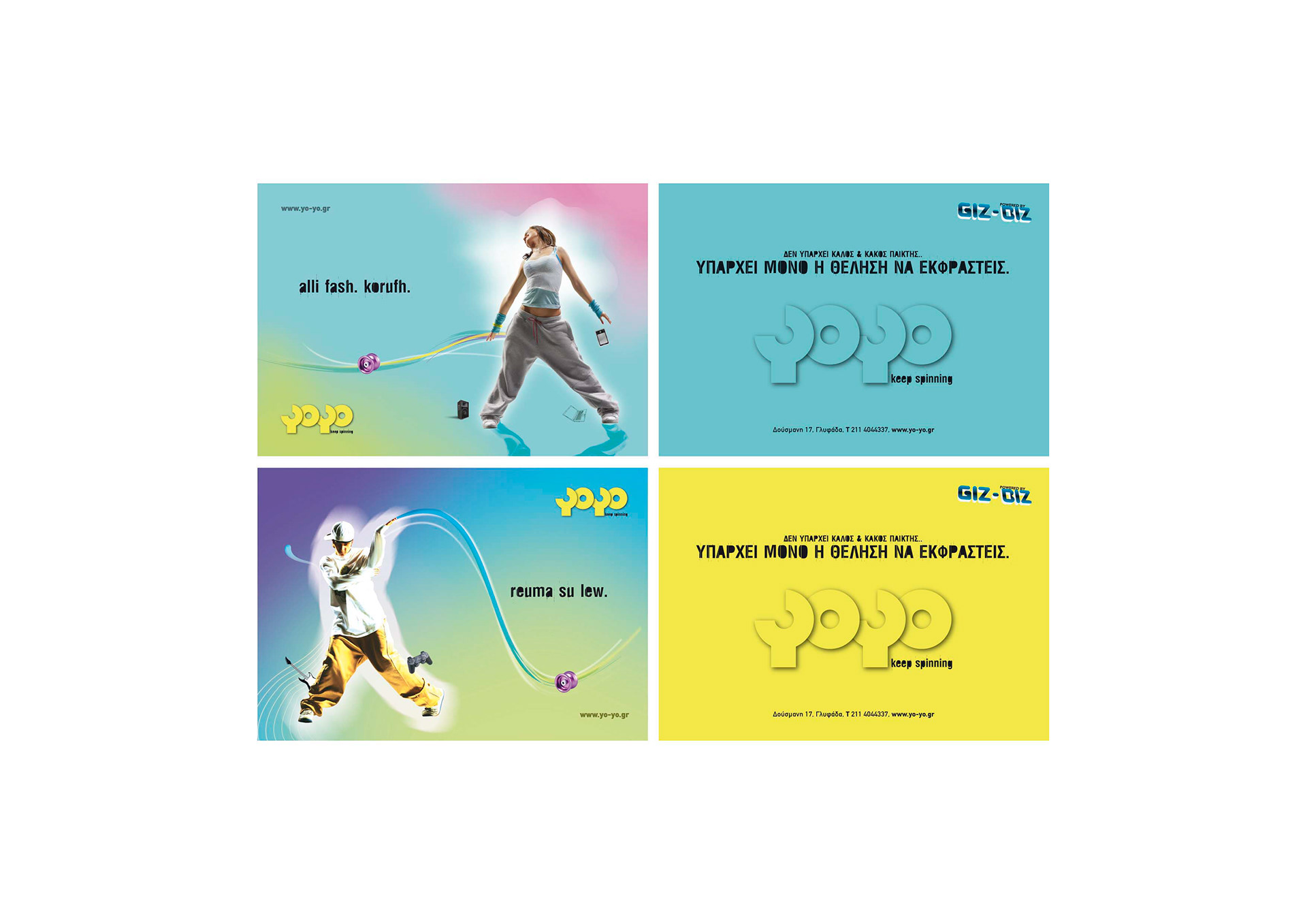
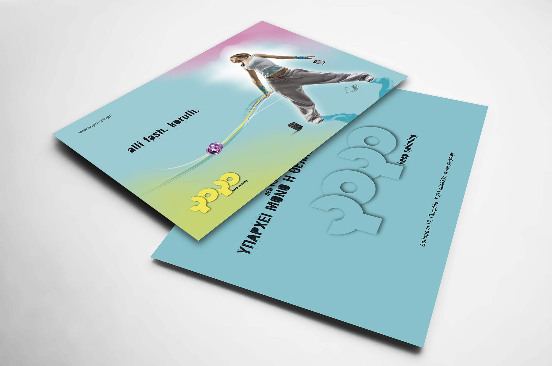
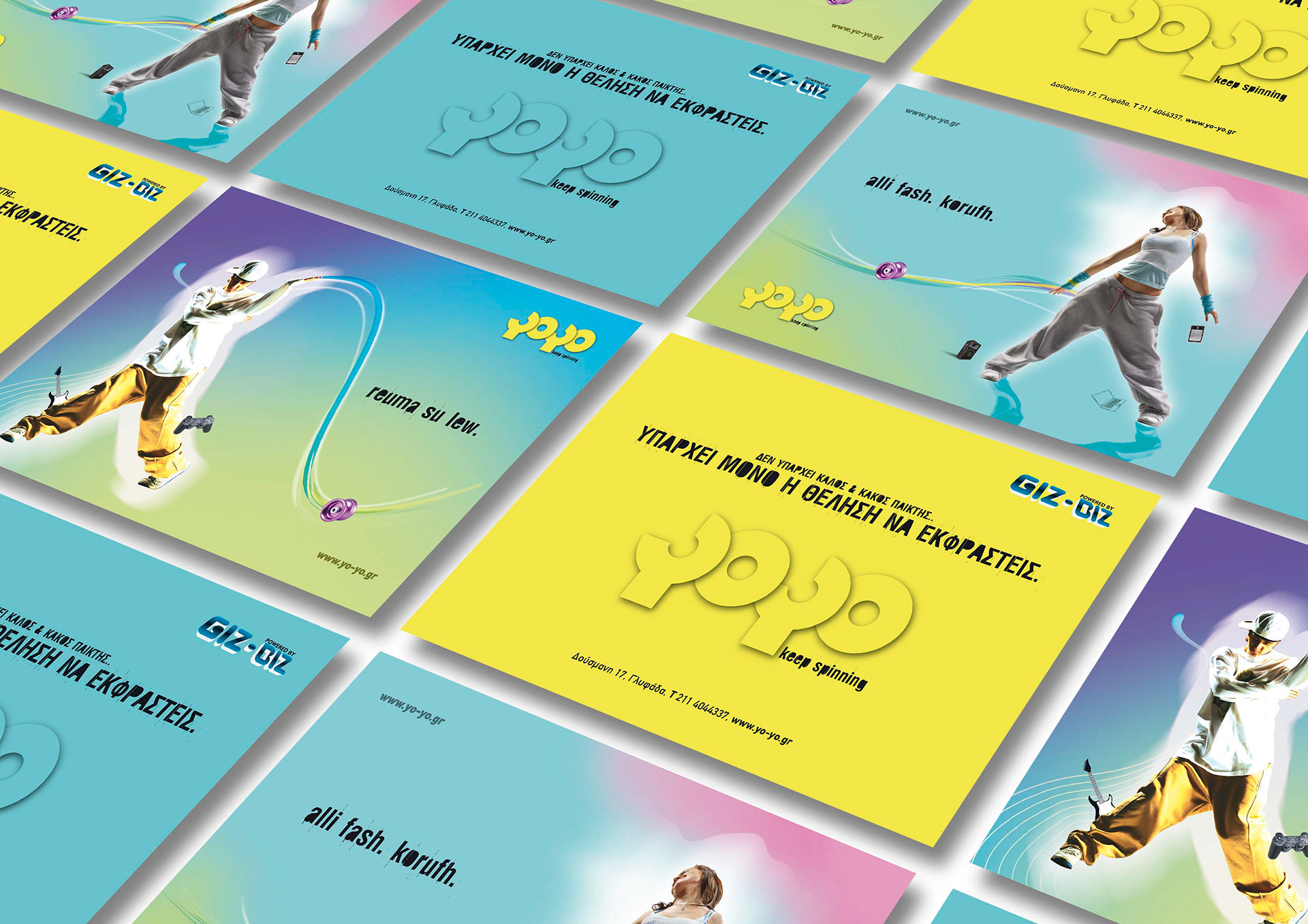
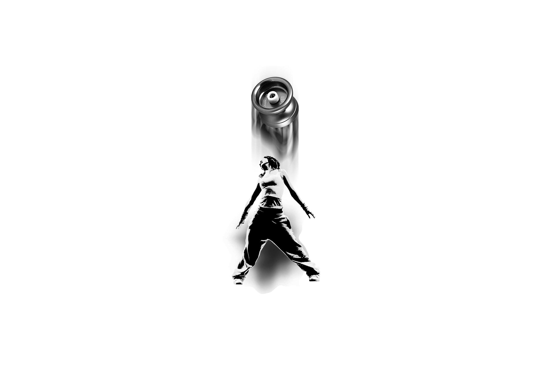
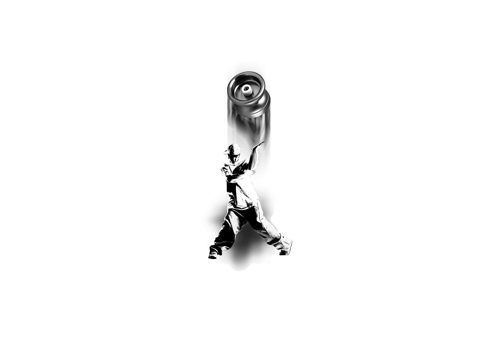
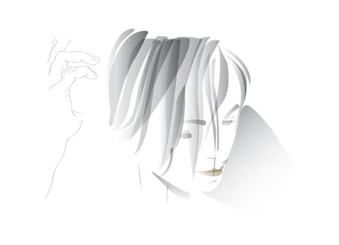
Logo design based on the toy itself. We used yoyo shape as a font for our logo. Simple and clean lines that will balance with the curvy moves of the performers. Floating graphics that follow the youth culture and language of the users.
You may also like
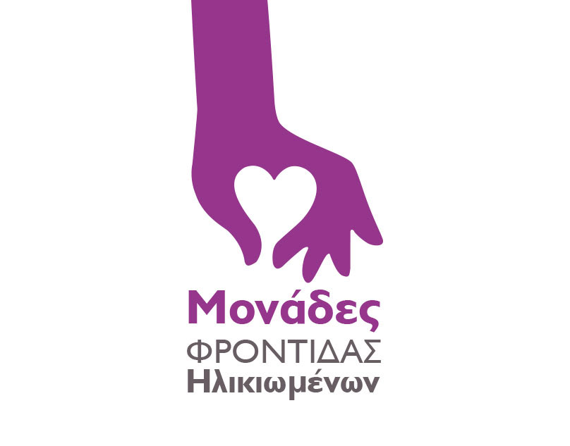
Ioli Senior Care
2018
logos
2010
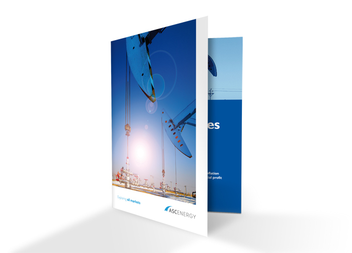
Asc Energy | Brochure design
2016
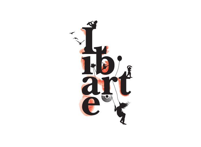
Libarte
2014
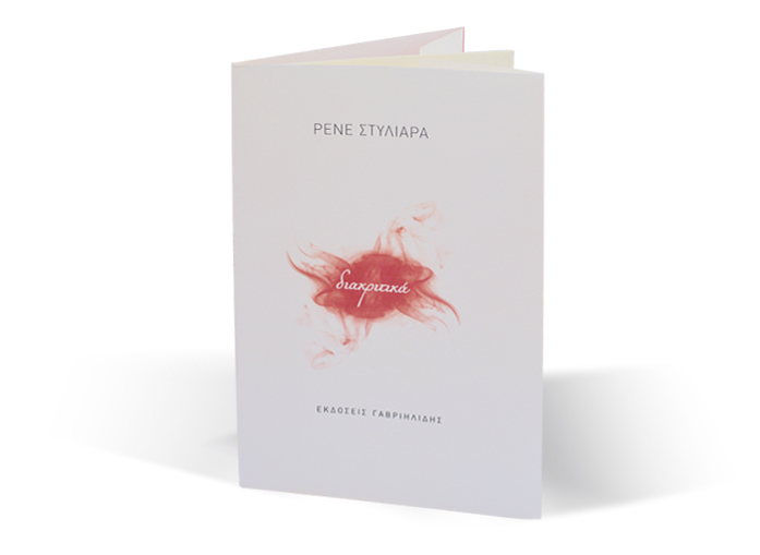
Diakritika | Book Cover
2013
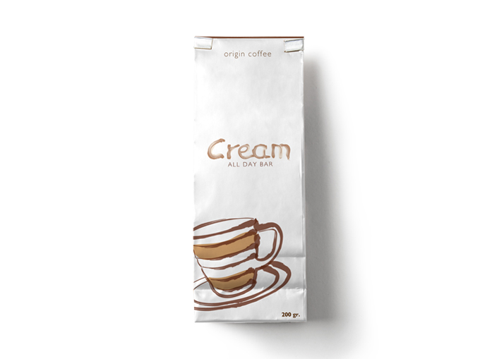
Cream Cafe
2015
anna anastasiou flyers
2016
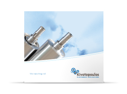
V. Kivotopoulos SA
2013
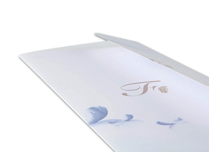
Feather (cafe/bar)
2012
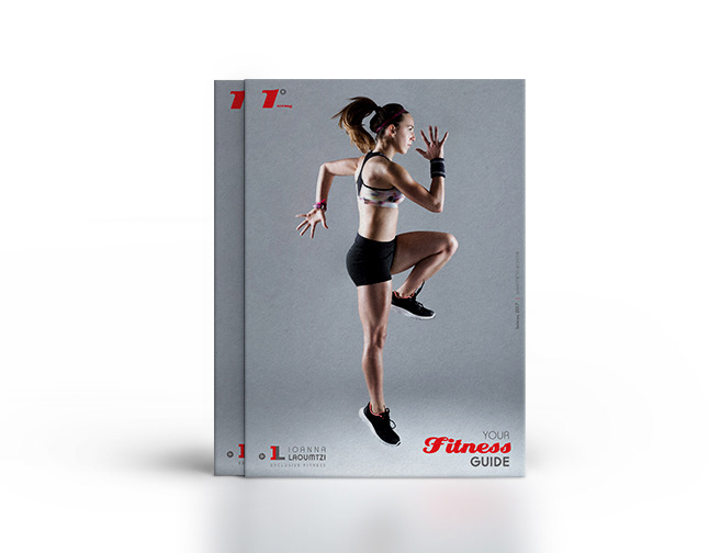
IL Exclusive Fitness
2017
↑
Back to Top