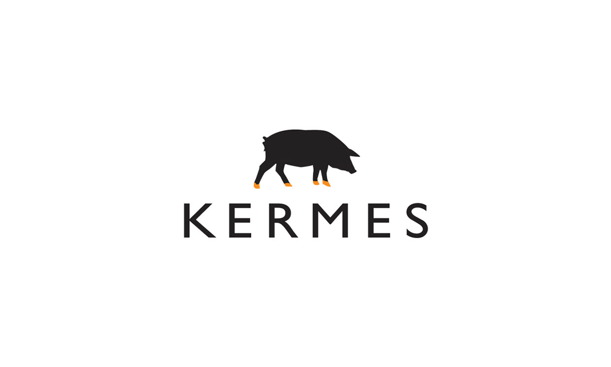
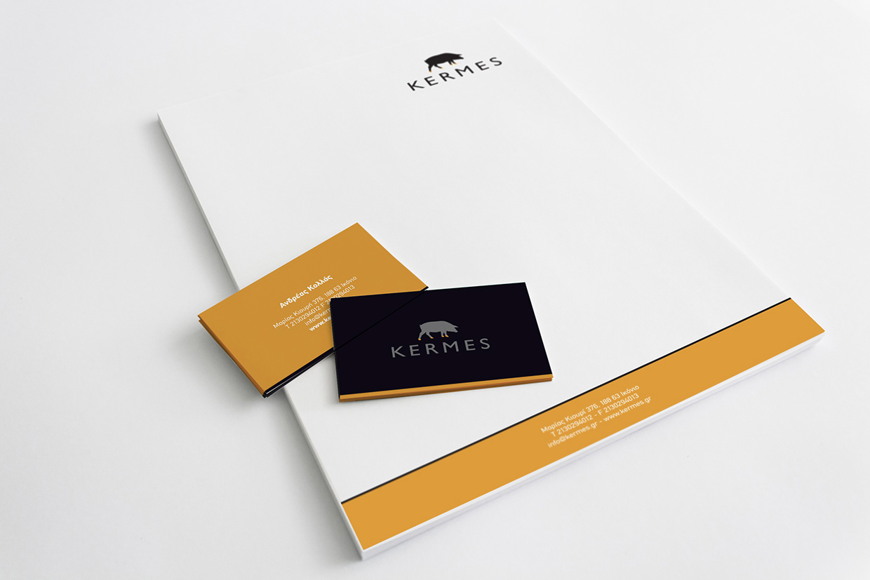
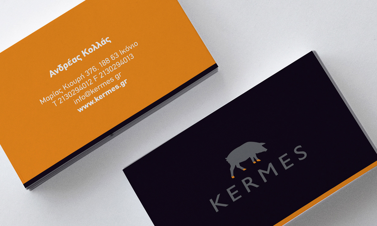
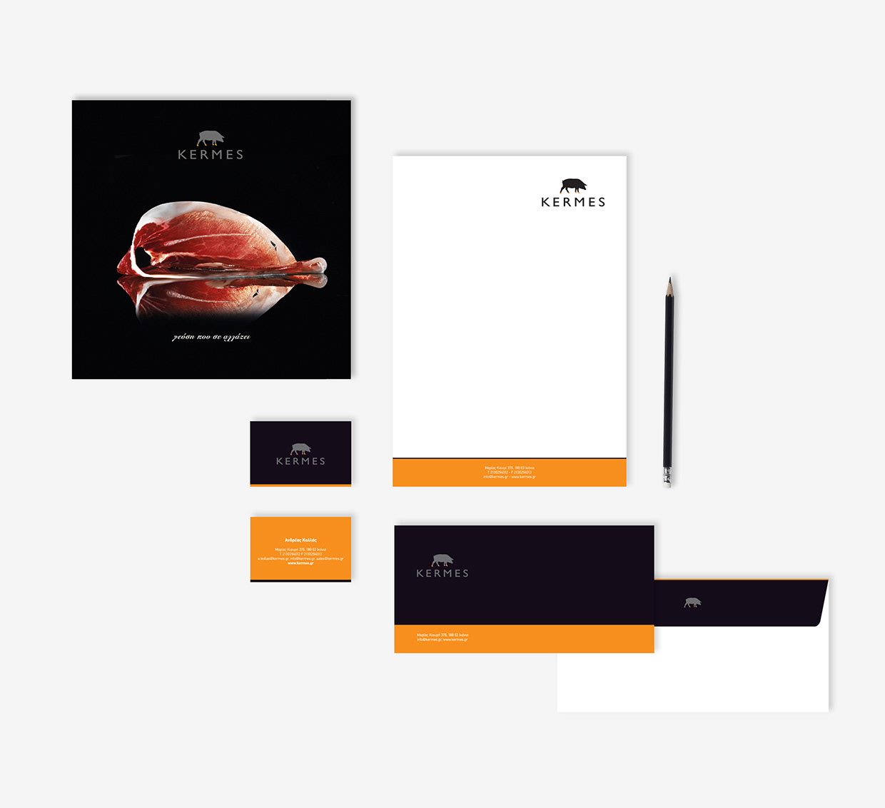
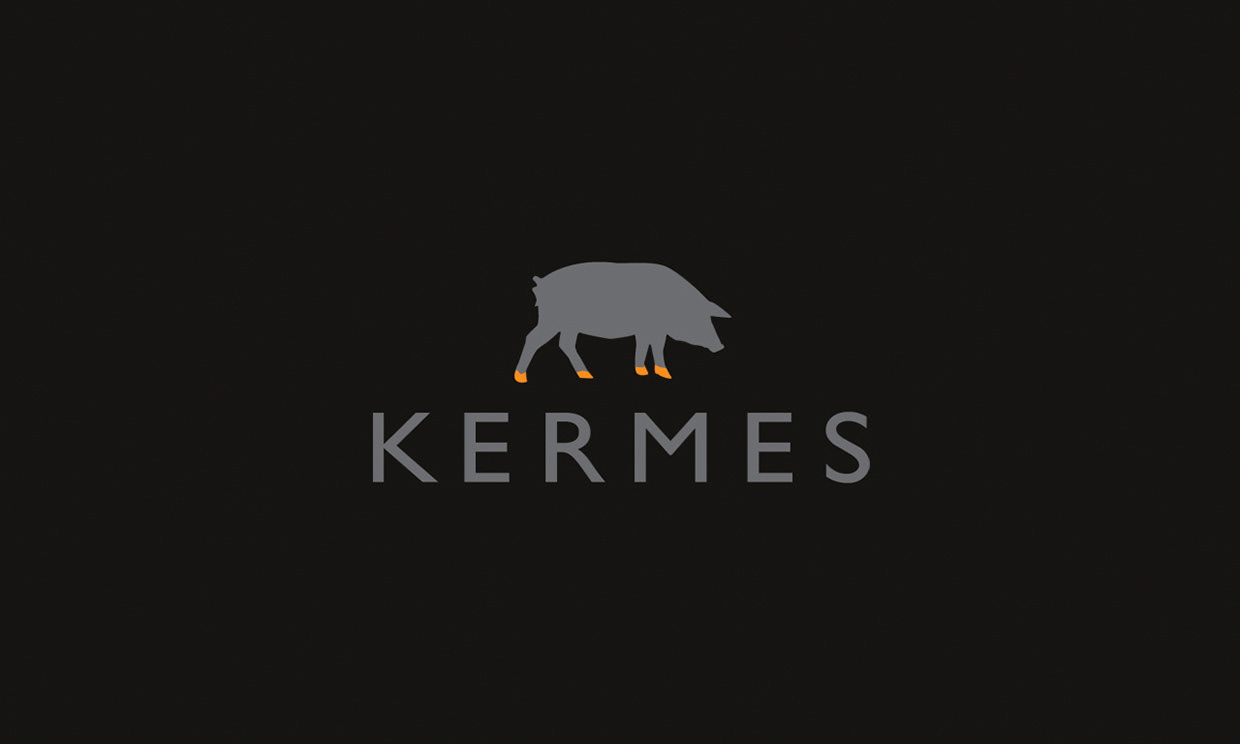
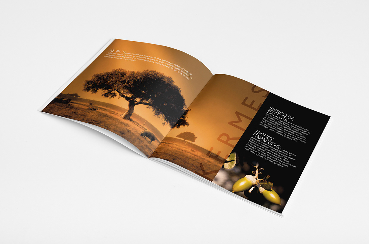
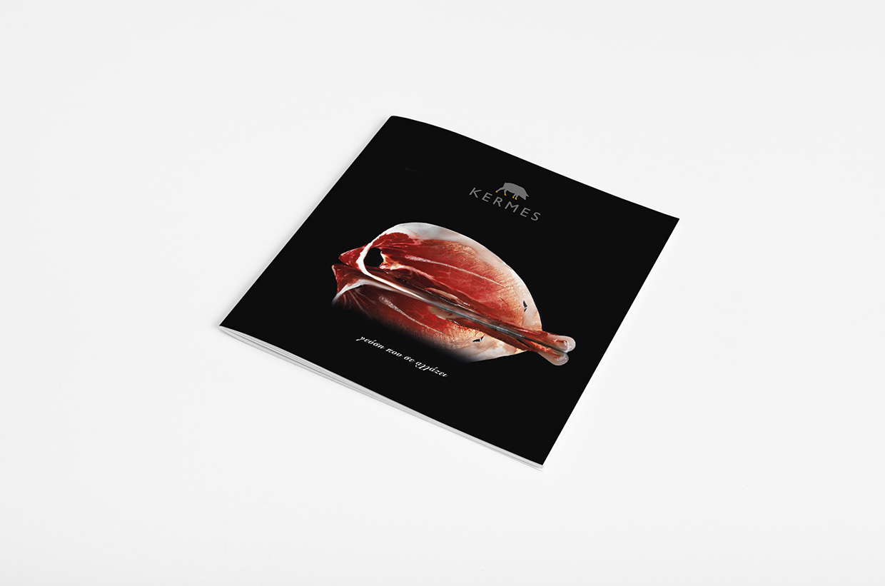
Kermes company is based in Athens Greece and imports (dry cured meat) from Spain.
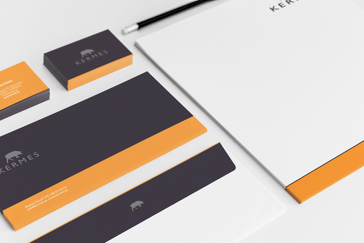
The symbol of the logo is the pata negra pig (iberico pig) and its unique characteristic; the black feet. We decided to develop a logo based on this unique characteristic and identify in this simple way our product.
The product is Kermes company and Kermes company is the product.
We developed a simple design approach to symbolize the pig in order to differentiate the color of its feet which identifies this specific breed. The design lines used in this logo aim to characterize the product as healthy, premium quality and very well bread, exactly what a consumer seeks for his/her nutrition.
It’s a strong, unique logo that reflects the product itself. Dynamic, simple and easy to the eye.
Floating Concepts
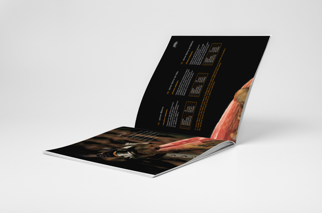
Client: Kermes
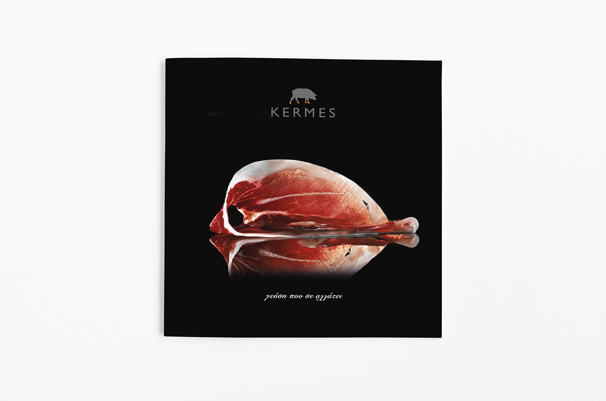
Cover Photography: George Kountouris
Print: Elikon
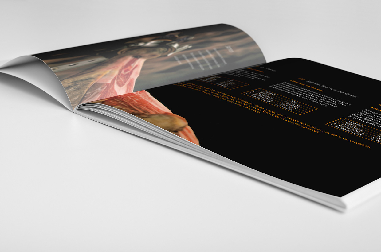
Client: Kermes
Cover Photography: George Kountouris
Print: Elikon